One often noted statistic is that, for most occupations, inflation adjusted wages have not kept up with labor productivity increases. When discussing productivity and trade we made the case that both tended to reduce the costs of goods and services and that would show up as inflation adjusted increases in people’s incomes. Indeed, after World War II and until about 1970, labor productivity and wages of non-supervisory employees grew at the same rate[1].
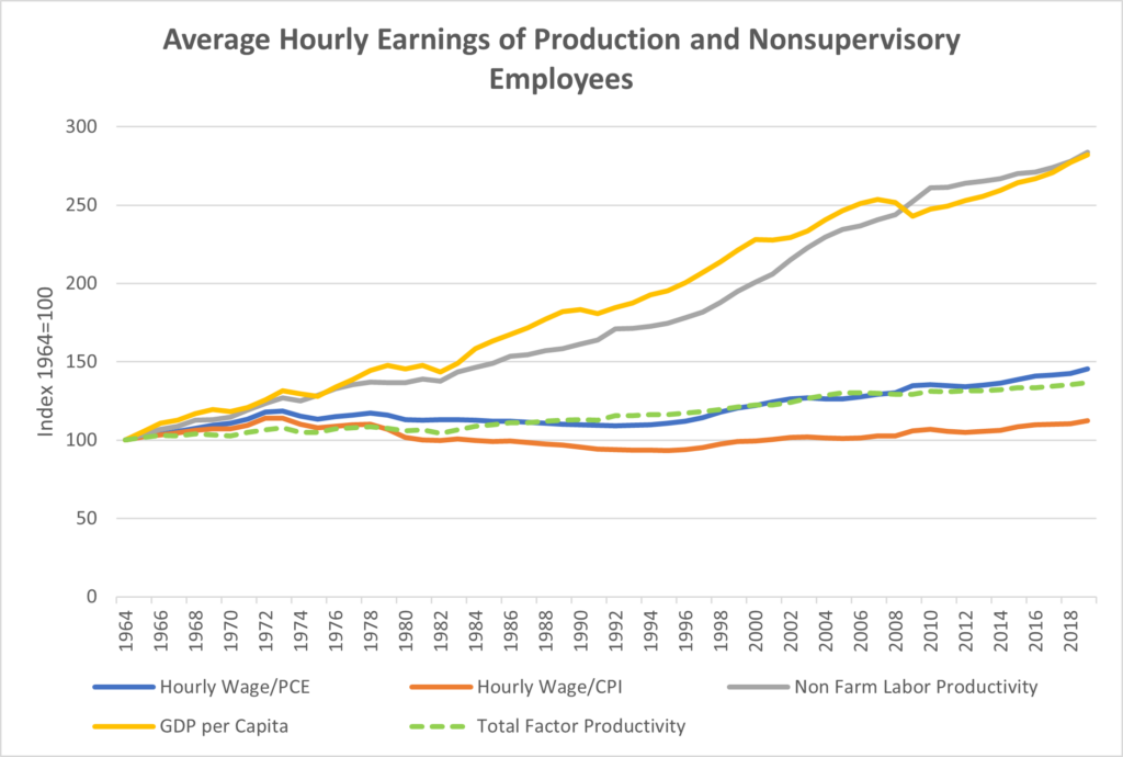
Figure 37: Average hourly earnings of production and nonsupervisory employees adjusted for inflation two ways, labor productivity growth, real GDP per Capita, and total factor productivity growth. Data sources: BEA table 2., FED from Penn world table 10.1 WW122
However, the chart above shows that hourly wages for non-supervisory employees adjusted for inflation using two different inflation measures (the orange and blue lines), stagnated from the early 1970’s through the late 1990’s even though labor productivity (the gray line) grew enormously. The chart also shows total factor productivity as a dashed green line. As explained in the primer, total factor productivity is designed to capture the increase in output that is not explained by increases in inputs such as labor, capital, and energy. If one looks just at labor productivity one might well think that the value of an hour of labor should increase along with the additional value of output from that hour of work. After all, in inflation adjusted dollars, the same hour of work produces over 2.5 times the value of output. But total factor productivity (TFP) hasn’t risen nearly as much. How are both possible?
Here it helps to do a thought experiment. Let’s say a factory employs 200 people. Newer technology makes it possible for the owner to replace 100 of these workers with machines, but the machines cost the same amount to finance and maintain as the employees they are replacing. Total output remains the same, and so do costs. Since there are now only 100 employees producing the same output as 200 before, labor productivity, which is output divided by work hours, has doubled. But the factory owner can’t afford to pay the remaining workers more because neither output nor costs have changed. Total factor productivity change might very well be zero in this case, and wages wouldn’t change, but labor productivity doubles.
This helps explain the seeming paradox in the chart. We already know that in manufacturing many workers have been replaced by automation. These machines cost money to buy and run and so wages can’t go up as much as labor productivity. The workers let go create a surplus of labor which holds wages down, which in turn can reduce the incentive for further automation depending on the cost.
In the chart, the fact that labor productivity has grown enormously but total factor productivity has grown only slightly, points to a substitution of machines for humans as a major driver of labor productivity gains, something we saw earlier in Figure 13 . How much could real wages have risen? If we assume, reasonably, that the cost of buying and operating the machines is less than the cost of the labor they replace, then in the chart above, all I think we can safely say is that average wages could have grown at a pace between the dashed green line for total factor productivity and below the one for labor productivity. Looking at actual profits is a much better way to determine whether labor is fully sharing in productivity gains since it relies on real world total productivity decisions by businesses which weigh all the costs, including various types of labor. We’ll look at profits shortly.
Figure 37 can’t tell us how much wages could have gone up over the period from 1964 to 2019, but it clearly shows that for an extended period real (inflation adjusted) wages languished for most workers and suggests that this is at least partly because overall total factor productivity grew only slowly[2].
[1] https://www.epi.org/productivity-pay-gap/
[2] Income usually rises with seniority, which may tend to hide wage stagnation in our personal lives. The chart shows averages.