The US has a federal system, and states and localities raise and spend roughly as much as the Federal government. Actually, states and localities together spend more than the Federal government but raise less because the Federal government transfers a lot of money to them. The graphic below shows 2017 government spending. The yellow area is transfers of revenue from the Federal government to states and localities.
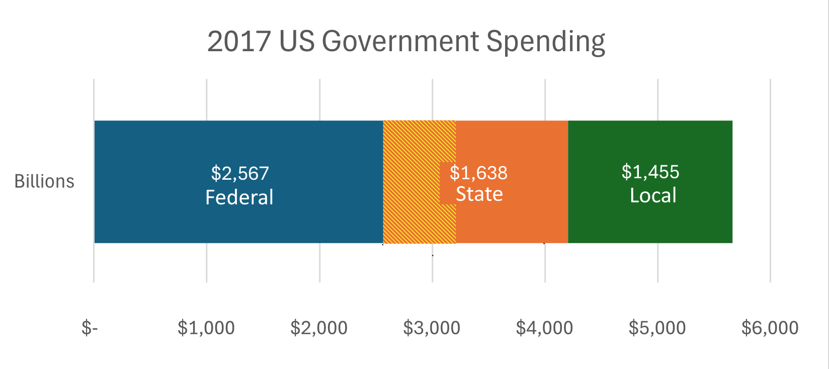
Figure 1 2017 US Government Spending. Yellow area is Federal transfers to state and local governments. Source see note [1] ww133
Governments get most of their money from taxes, so “spending” by government at any level is really about buying stuff on behalf of taxpayers. We give up some of our purchasing power, say to add another cable channel to our lineup, to the government, say to help pay for a school or an aircraft carrier. Unfortunately, people, including many of the already immensely rich, don’t like giving up purchasing power even for things they understand we need, so there are and will always be endless squabbles over who pays and what we buy through governments. It is important to keep in mind that our tax dollars aren’t loaded into a rocket and sent off into space. All of the money the government collects and spends goes to people or businesses, it is spending that drives the economy just like consumer spending does. In fact, much of it comes back to us, we pay Social Security taxes now so that we can spend our Social Security incomes later. Even foreign aid, military or otherwise, is often directed to purchases from US suppliers. In short government is an integral part of the economy, as any lobbyist knows[2]. In 2017 about 29% of US Gross Domestic Product (GDP, the total output of the country) flowed through our Federal, state, and local governments[3]. Here’s how we spent the money in 2022.
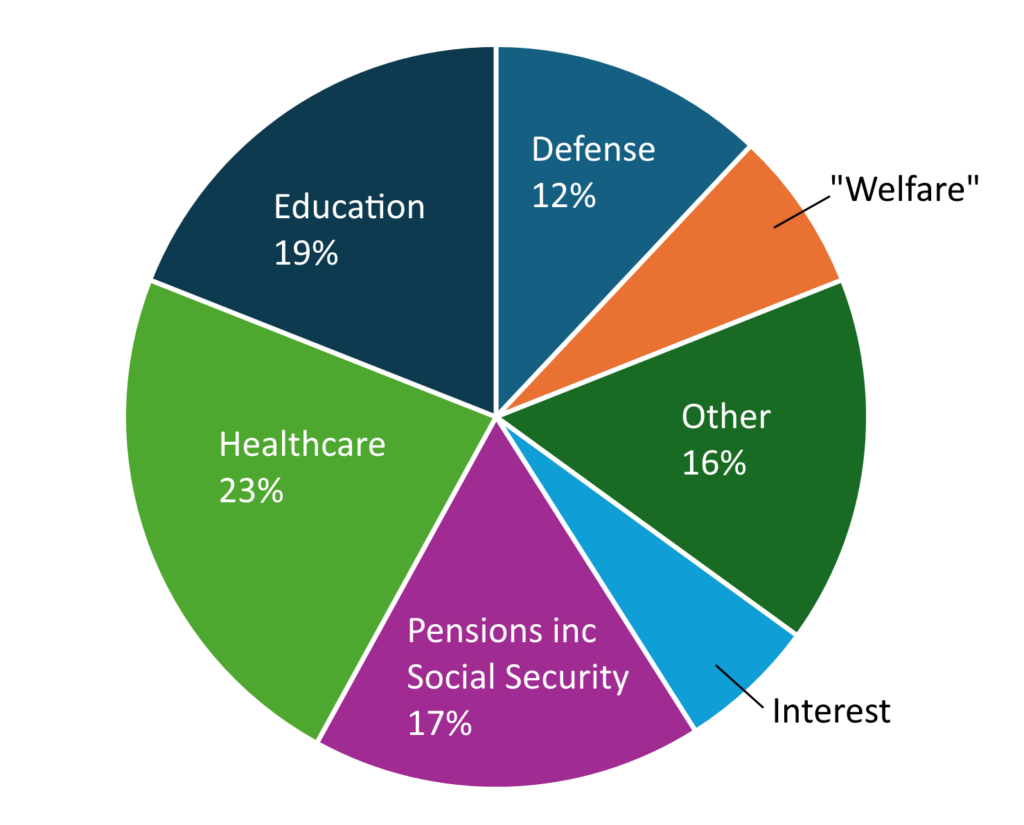
Figure 2 2022 Federal, state and local spending by function. “Welfare” includes food stamps, unemployment benefits, workers compensation, housing, cash welfare, earned income credit above tax liability and others but excludes health care (Medicaid). “Other” includes transportation, protection (police, fire etc.) and general government. “Spending through the tax code” not included. Source: see note[4]. WW134
Looking at it this way, spending 30% of our income on healthcare, pensions, education, defense, plus everything else governments do, like roads and police, might not seem like a bad deal. As we have seen in Part 2, education and infrastructure are keys to having an advanced economy and few of us want to give up our pensions or do without healthcare.
Budgets are contentious at all levels of government (I’ve attended Town Meeting for 25 years in my hometown), and certainly lobbying and special interests often get their way (ditto), but we can’t possibly deal here with 52 states and innumerable local budgets. Let us look at the roughly one half of government spending that flows through the Federal government and the taxes that are collected to fund it.
Here is the Federal budget from fiscal year 2023.
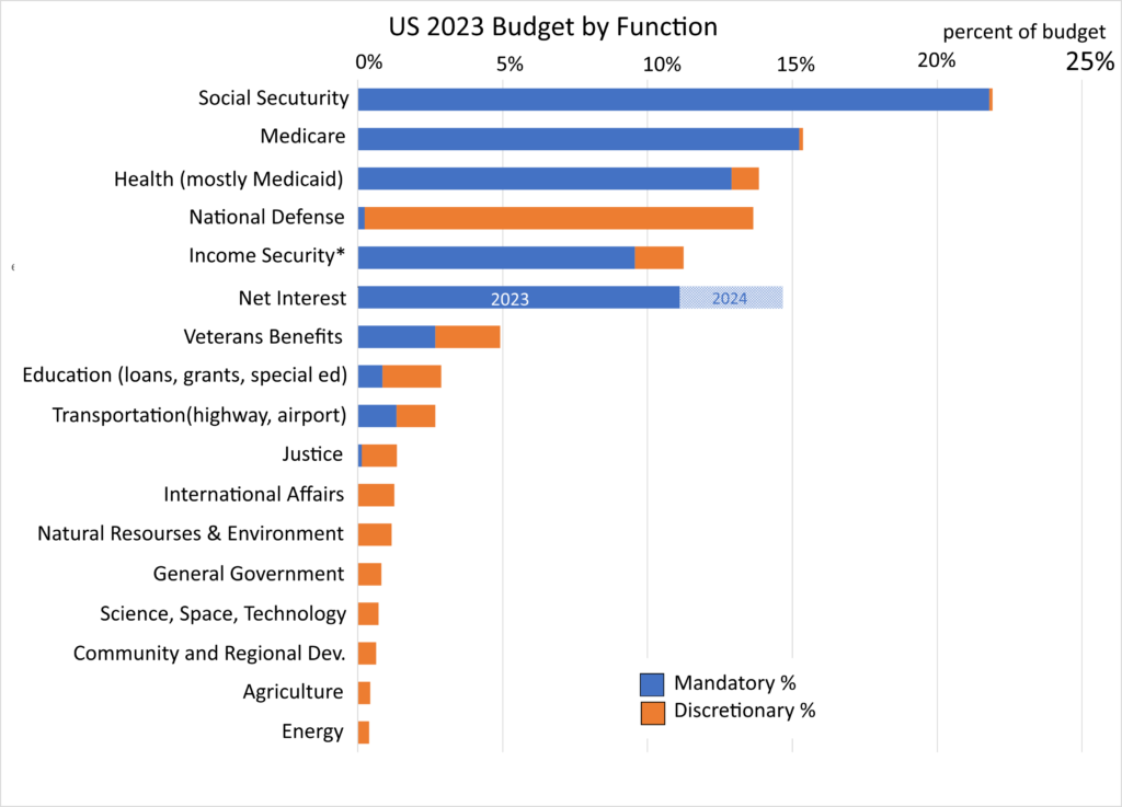
Figure 3 US Federal 2023 Budget. Source: https://www.govinfo.gov/app/collection/budget/2023/BUDGET-2023-PER except for actual net interest from treasury data WW128
* Income Security includes Federal employee retirement, earned income refundable credit, food stamps and other programs.
We can see a number of interesting things about the budget from the chart. First, most of it is “mandatory,” meaning Congress set up programs such as the Social Security Act where the legislation, until amended, provides a formula for making payments. Congress could, if it wanted, abolish Social Security, or lower or raise payments, but unless it does so, the formula used to calculate benefits “entitles” people to certain payments which have to be included in the budget. If you subtract mandatory and defense spending, you are left with 15% of the budget for everything else.
As noted above, a lot of the federal budget transfers money, it isn’t spent directly by the government. This includes the mandatory spending on the social insurance programs of Social Security and Medicare. Most of us pay, or paid, into the Social Security Trust Fund through our payroll taxes and when we retire our payments come from that fund. Until recently Social Security ran a surplus. In 2022 the trust fund had a positive balance of around $2.7 trillion. Medicare also involves a pair of trust funds, but payroll taxes are inadequate to cover costs, and general tax revenue provided 43% of required funding in 2023. Medicaid is a joint state/federal program with the federal government providing about 70% of the funding from general revenues.
Income security mandatory items include the earned income tax credit which was signed into law by President Ford and substantially expanded by President Reagan. The earned income tax credit is “partially refundable” meaning that poor families can get up to $1,600 per child in cash if the credit exceeds their income and payroll tax liability. About 20% of the mandatory income security line item in the chart is the earned income tax credit and child tax credit. A similar amount is for retirement benefits for government employees, with slightly smaller amounts going to military retirement and food stamps.
Interest payments are of course mandatory. Interest on the $34 trillion national debt was $658 billion in 2023. Those payments are tied to interest rates and the hatched area in Figure 3 shows that as interest rates have risen recently the payments on the debt have also and are now about the size of defense spending[5]. About 1/3 of our national debt is held by foreign governments and entities, those payments dwarf foreign aid. If we don’t want to “send money overseas” we should reduce our deficit and borrowing.
How has federal spending changed over the years? Here the breakdown since 1940:
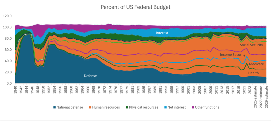
Figure 4 US Federal Budget by Major Function. “Income security” includes Federal employee retirement, unemployment, housing and food assistance. “Physical resources” includes energy, natural resources, housing, transportation, and commerce. In addition to health-related spending, “Human resources” includes the subitems shown as well as education & training and veterans benefits and services not counting health. “Health” includes all health related other than Medicare (Medicaid, Veterans medical care, research, etc.) Source: https://www.whitehouse.gov/omb/budget/historical-tables/ Table 3.1. The chart omits offsetting receipts (less than 1%) which explains the slight deviations from 100%. WW132
As we will see, the overall Federal budget hasn’t changed much as a percent of GDP since 1975 but Medicare and Medicaid have gone up from a combined 8% of the budget to 28% in that time. In Part 2 we looked at how much of an outlier US medical costs are, those costs are passed on to both private insurance and taxpayers. The fix is to reduce the costs, around 17% of GDP, to be in line with other rich countries, at 12% of GDP for universal coverage, a task in progress. Even then, though, health care costs are not going down to historical levels because there is simply more and better medicine now and the population is getting older.
Defense spending has declined as a percent of the budget and US GDP. It is currently around 3.5% of GDP.
The fact the budget hasn’t grown much as a percent of GDP despite the large run-up in medical costs is truly amazing. But what has grown is the deficit as a percent of GDP and along with it the national debt. The chart below shows expenditures and deficit as a percent of GDP. The spike in expenditures around 2020 is associated with emergency COVID spending together with a dip in GDP. The spike in 2008 marks the sub-prime mortgage credit crises which Obama inherited at the beginning of his term.
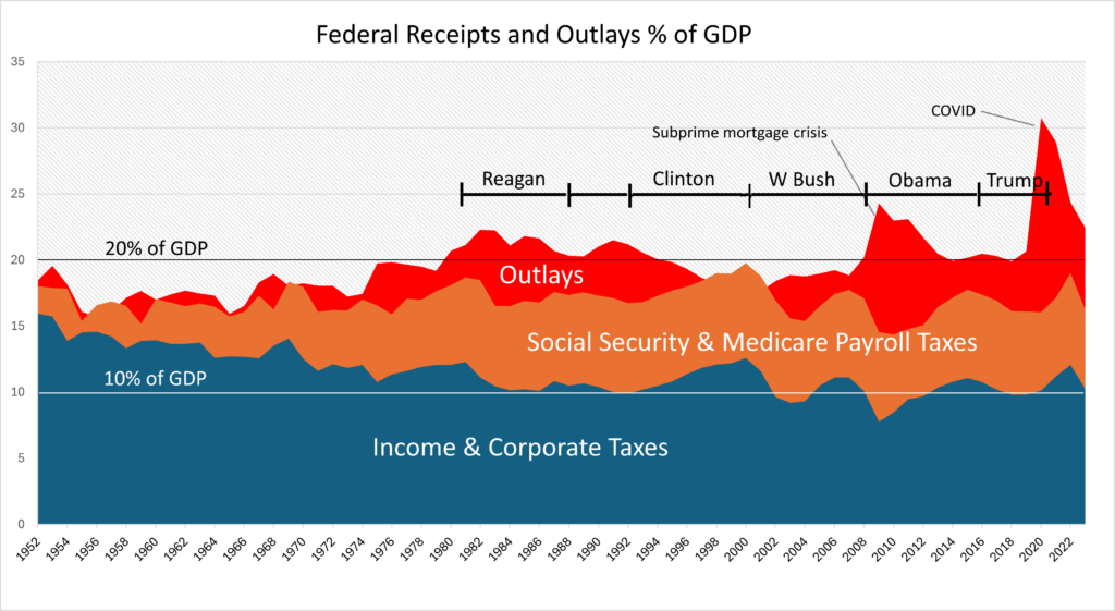
Figure 5 Federal Current Expenditures and Taxes as a Percent of GDP by Year. The spike around 2020 was COVID spending combined with a dip in GDP. Source: BEA, OMB via the Fed data interface, FRED. WW135
As the graph shows, income tax revenue has fallen from 15% to 10% as a percentage of the country’s total income, GDP, while outlays have gone up somewhat, resulting in more borrowing and larger deficits. The red area in the chart is deficit spending. The deficit increased dramatically as a result of the Reagan era income tax cuts and increased spending. Under the Clinton administration, the Tax Reform Act of 1993 modestly raised taxes on the wealthy and corporations and cut spending. By 1998 it allowed Clinton’s administration to run the first budget surplus in three decades and the last one to date. Under the GW Bush administration these tax increases were quickly reversed. It is estimated that the top 1% saw a tax cut of $50,000 per year[6]. Deregulation, which was a mantra under Reagan and Bush, resulted in the subprime mortgage meltdown in 2008 which required a mountain of red ink to fix. Most recently COVID, a natural disaster, also required huge deficit spending to keep the economy from tanking.
The chart below shows how this deficit spending adds up over time.
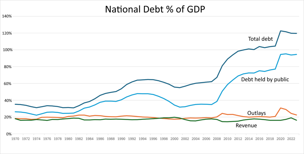
Figure 6 National Debt as a percent of GDP. Source: FRED WW140
In the chart, there are two lines shown for debt: debt held by the public and total debt. Why? Because a lot of debt is “intragovernmental” loans. Social Security ran a surplus for many years and accumulated $2.7 trillion in the Social Security Trust Fund by 2022. That money was “invested” in special Treasury bonds, which then reduced the amount of public borrowing the Treasury had to do to close the deficit. In the chart above, total debt includes intragovernmental borrowing, while the “debt held by the public” line is the amount of actual public borrowing the Treasury had to do. The difference between the two lines is the amount our right pocket borrowed from our left one. Of course, we’ll have to pay that money back to ourselves if we’re going to collect full social security benefits. In effect, we borrowed Social Security surpluses to partly finance income and corporate tax decreases which benefited the wealthy most (as do any broad tax cuts.) To make matters worse, when the Treasury borrows money, it does so by selling bonds which are interest bearing IOUs. When interest rates go up, the cost of this borrowing increases, and as we saw interest payments are now about the size of the defense budget. Of course, if interest rates drop so will interest on the national debt.
[1] : https://federalism.us/federalism-101/an-overview-of-federal-state-and-local-expenditures/#:~:text=Of%20the%20total%20amount%20of,30%20percent)%20in%20public%20spending and https://www.whitehouse.gov/wp-content/uploads/2024/03/hist12z1_fy2025.xlsx
[2] A great tool for exploring US spending which lets one drill down within each spending category is provided by the Treasury at https://www.usaspending.gov/explorer/budget_function
[3] National income is total income earned
[4] Percentages are approximate given the way the Census collects data. These numbers are taken from a Wikipedia entry in turn based on https://www.usgovernmentspending.com/year_spending_2022USbt_25bs2n whose author must be commended for his effort and transparency.
[5] The chart shows budget authorization for 2023 but actual spending expected in 2024. Actual net interest payments in 2023 were 10.7% of the budget in 2023. https://www.whitehouse.gov/omb/budget/historical-tables/ Table 3.1
[6] https://www.cbpp.org/research/the-legacy-of-the-2001-and-2003-bush-tax-cuts
