Now that we’ve looked at how the US Federal Government raises and spends money, we can look at some of the economic issues we face and how they relate to these changes in government taxation and spending. Remembering that in a democracy, the government is us, we can then look at how we could address some of these issues.
Productivity has continued to grow in the US, which means that every year we produce more goods and services per hour of work than the year before. In the past, median wages and salaries grew in sync with productivity. That is the expected result of productivity increases: if labor on average produces more per hour of work, then workers, on average, will get paid more per hour of work. After all, the value of all the goods and services produced in a country is its gross income and that goes up per worker when productivity increases. As many authors have noted, though, for the last 50 years inflation-adjusted incomes for most workers have not risen along with productivity increases in the US. The chart below shows this relationship. “Net domestic product per worker” is the value of output per worker with depreciation of machinery, infrastructure, housing, and other capital goods taken out. It is the amount of money every worker could be paid if national income was distributed evenly.
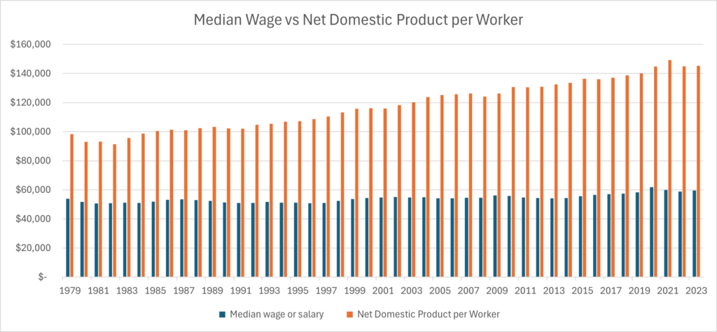
Figure 8 Median Wage vs Net Domestic Product [RF1] in inflation adjusted 2023 Dollars. Sources: BLS and BEA via FRED[1] WW137
The gap between the blue bars (median wage or salary) and the orange bars (how much on average workers could make if all net national income was distributed to workers) represents a huge amount of moola. It is also clear that in 2023 this gap was much larger than in 1979.
Where has all this money gone? The answer is that income inequality has risen. Income at the top of the income spectrum has risen while the median wage income hasn’t risen at all in purchasing power over the last 45 years.
We should note that “income” has varying definitions. In the chart above we are looking at how “national income”, which is the value of everything the economy produces in a year, is distributed. National income doesn’t include capital gains because selling an asset doesn’t increase output, it just transfers ownership. This is unlike the definition of income for tax purposes which includes capital gains. Inequality researchers generally focus on national income when looking at the distribution of income. Ownership of capital comes into play when looking at wealth inequality.
The charts below shed more light on how national income distribution has changed over the last century.
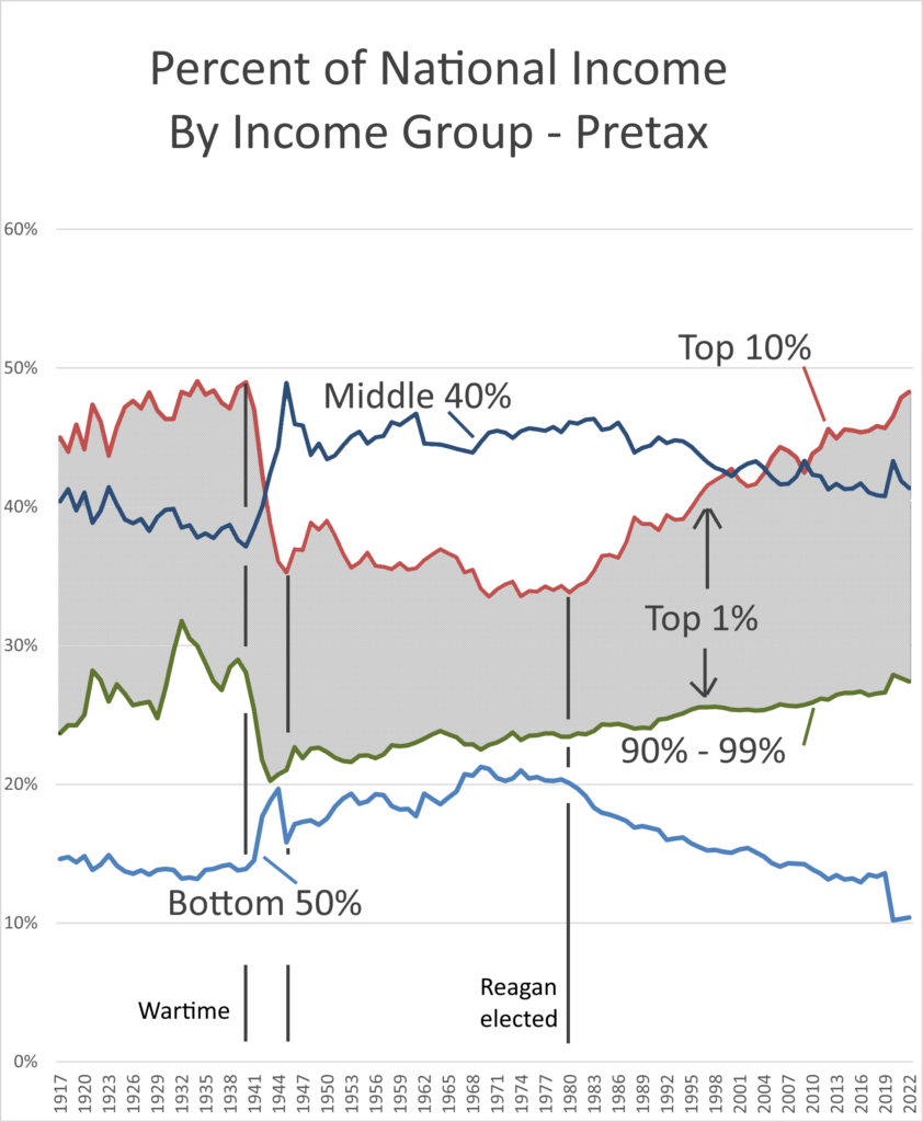
Figure 9 Pretax share of national income by income group. Includes pensions but not capital gains, taxes or transfers other than public pensions. Source: World Inequality Database WW143
Figure 9 shows how national income has been distributed between income groups over the years. The bottom 50% currently has about 15% of national income. The green line is the share of income of the top 10%, not including the top 1%. The grey area is the percent of national income going to the top 1%. During World War II, price and wage controls reduced the top 10% and top 1% share of national income and after the war high marginal tax rates kept a lid on those shares. Meanwhile the middle 40% share increased during the war and stayed there until the late 1970’s, while the bottom 50%’s share of income went up over the same period.
Reagan was elected in 1980, and Congress passed his first big tax cut in 1981. Almost immediately the upper one percenters’ share of national income started rising and middle- and lower-income group shares fell.
The same chart looks a bit different after taxes and transfers.
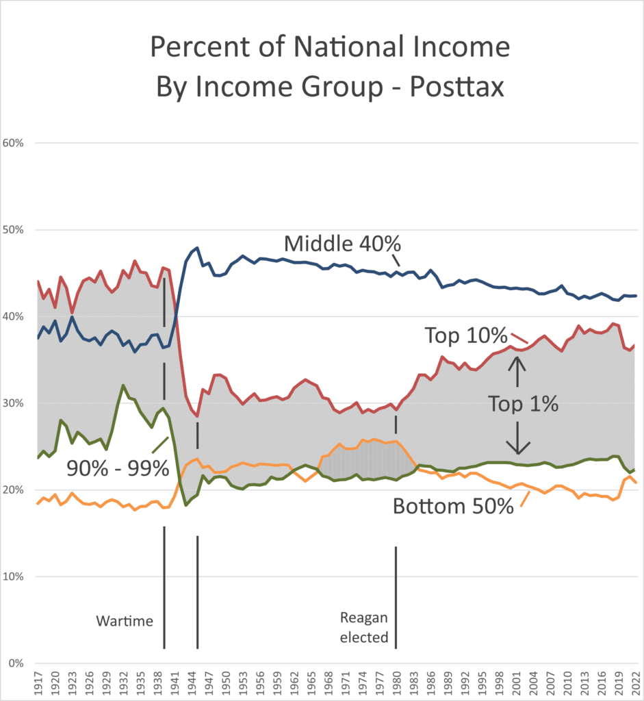
Figure 10 Share of National Income after taxes and transfers. Taxes include Federal State and Local. Source: World Inequality Database WW143
In Figure 10 we see that taxes and transfers have distributed a bit of national income from the top 10% to the bottom 50% but haven’t made much of an impression on the top 1%. (The dip in top income share with the matching rise in the bottom 50% after 2019 is a temporary COVID relief bump.) Meanwhile, as we saw in Figure 5 the national debt has ballooned because tax cuts were not matched by spending cuts. In fact, the Reagan tax cuts were across the board and included expanding the Earned Income Tax Credit, so spending went up while tax receipts went down.
These two charts show that share of national income has grown for the very top of the income distribution, the one percenters, and declined for the middle class and lower 50% of the income distribution. The growth in share for the top 10% without the top 1% is modest after taxes. But even within the top 1% growth in income share is skewed. The chart below shows the growth in actual dollar mean (average) income per adult for groups within the top 1%.
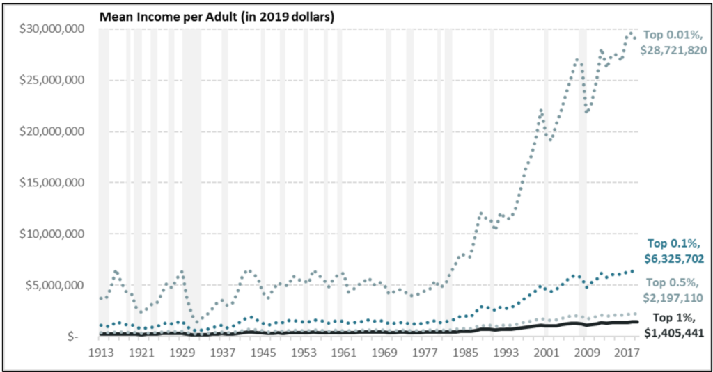
Figure 11: Mean Income Per Adult, Top 1%, 1913 to 2017 – Note that lower income groupings include higher ones (e.g. top 1% includes top .5% and .01%). Source: Sarah A. Donovan, Joseph Dalaker, Marc Labonte, Paul D. Romero. 2021. “The U.S. Income Distribution: Trends and Issues.” Congressional Research Service.
We can get an idea of what this increase in national income share is worth in dollars by noting that at the time Reagan was elected the top one percent share of national income was a bit under 30% and just before COVID in 2019 it was nearly 40%. Ten percent of net national income is around $2.3 trillion dollars per year as of 2023. That works out to over $14,000 per worker in the US. A lot of moola indeed.
What caused this shift of national income from bottom and middle to top? The economy is complex and there are many interrelated factors. In the end though inequality would be significantly reduced if we restored the progressive income tax rates that we had pre-Reagan while trimming tax avoidance. I outline such a program below. It is still worth briefly mentioning the factors that did, and did not, contribute to the rise of the top one percent share of income, and the stagnation of median incomes.
We’ve already mentioned tax cuts. Reagan’s 1981 tax cut slashed Federal revenue by 2.9% of GDP, surpassing even the 2.7% tax cut at the end of World War II. The deficit ballooned so quickly that Reagan agreed to a series of tax hikes to restore about half of that revenue loss. When Reagan was elected the top marginal rate was 70% and by the time he left office it was 28% and applied to adjusted gross income above around $30,000. The top rate has never recovered[2].
Aside from taxes, technology change, such as the automation of manufacturing, is often mentioned as having disproportionately benefited workers with higher education and specialized skills, leading to increased wages for these workers while wages stagnate for less-skilled workers. But evidence for what is called skill-biased technological change is lacking and, in any case, wouldn’t explain the increasing one precent share. It is more likely that technology change was one of several factors that lead to a decline in labor’s bargaining power, especially for lower income workers. The same could be said of trade and outsourcing and the union busting techniques that came into vogue around the time of Reagan’s election. In addition to these factors, there was a change in corporate culture that prioritized shareholder value over other stakeholders, such as employees, leading to a focus on short-term profits and cost-cutting, including wage suppression. Shareholder primacy in turn led to ballooning CEO compensation, often tied to stock performance, which contributed to the income gap between top executives and average workers. To all these factors we have to add the rise of enormously profitable “superstar” firms in technology and pharmaceuticals and other industries, often relying on intellectual property (patents) and network effects (getting there first, like Facebook). Finally, increased use of capital has slightly reduced the share of national income accruing to labor.
Trying to identify the relative contribution of each of these factors is probably impossible[3]. What labor has lost has in large part flowed through to the top one percent – actually mostly to the top one tenth of one percent – through profits. Corporate profits in the US have increased to about 12% of GDP from a long-term average of around 7% of GDP. These profits are distributed to shareholders and the wealthy get much of their income from these distributions. The chart below shows the increase in corporate profits as a share of GDP.
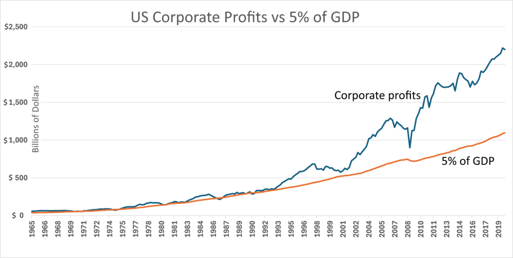
Figure 12: US corporate profits (all corporate types including C, S and REIT but not partnerships) vs 5% of GDP. Corporate profits have risen as a percent of GDP. Source: BEA via FRED (CPATAX series). WW147
Reagan justified his tax cuts for the wealthy by citing a theory called “supply side economics”. This theory supposes that the wealthy will invest their tax savings in business which will in turn stimulate productivity and drive down production costs. These lower costs will drive an increase in demand which will increase the size of the economy. That increase in the size of the economy will result in more tax revenue, enough to cover the cost of the tax cut. Supply side theory is often referred to as “trickledown economics” because the tax cuts for the wealthy will supposedly trickle down to the middle class. It runs counter to the widely accepted notion of supply rising and falling to meet demand, and productivity increases being driven by technology change. There is no empirical evidence to support supply side theory and indeed as we’ve noted, while any tax cut will stimulate the economy by increasing demand (demand side, not supply side), deficits ballooned as a result of these cuts. David Stockman, Reagan’s budget director, was quoted as saying that the tax cut “was always a Trojan horse to bring down the top rate…. It’s kind of hard to sell ‘trickle down.’ So the supply-side formula was the only way to get a tax policy that was really ‘trickle down.’ Supply-side is ‘trickle-down’ theory.” During the presidential primaries, George H.W. Bush referred to Reaganomics as “Voodoo Economics”. None the less, tax cuts for the wealthy were enacted during the George W. Bush and Donald Trump administrations. The Trump era tax cut of 2017 lowered the tax on corporate dividends, a major source of income for the top one percent, from the income tax rate (max 37%) down to the capital gains rate of 20%. That tax cut also lowered the corporate income tax rate from a maximum 35% down to 21%. In short, a double tax cut on corporate profits distributed to shareholders. Since spending hasn’t been cut we have been borrowing money, including Social Security Trust Fund money, to pay for tax cuts which benefit the wealthy most.
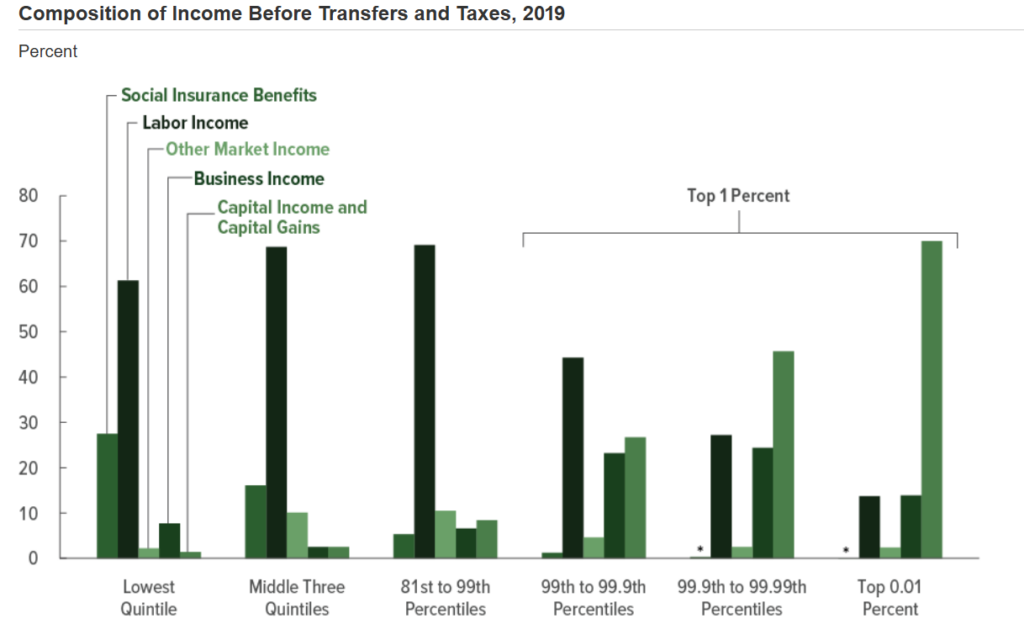
Figure 13: Percent Composition of Income Before Transfers and Taxes, 2019. Source: “The Distribution of Household Income, 2019.” Congressional Budget Office. July 29, 2022. WW206
[1] Inflation adjusted by CPI. Other inflation indexes such as the PCI might show higher growth but the ration between the two lines would stay the same. Net Domestic Product is the total value of output for final sale less depreciation.
[2] There were also tax cuts and expanded earned income credits in the bipartisan Reagan era tax bill of 1986 that effectively removed 6 million lower income Americans from the tax rolls. Furthermore, effective tax rates didn’t change as much as one would think from the change in marginal rates. The tax code is complex and high-income individuals had many ways to reduce their tax burden before Reagan as well as after.
[3] In Part 2 we saw that both trade and immigration are far less important than technology change in explaining deindustrialization, and both have had positive effects on real incomes.
[RF1]Use net national product or net national income instead
[RF2]Get rid of 10% as confusing. Maybe also show household fraction of national income by the same groups. Also get rid of COVID dip or update to 2024
