Income Distribution Between Countries
Worldwide, income varies widely between countries and also within countries. GDP per capita gives us an idea of how much income per person each country has, but of course the distribution of that income within the country can be more or less skewed as it is in the United States. In the section on worldwide productivity convergence, we showed this map of world GDP per capita:
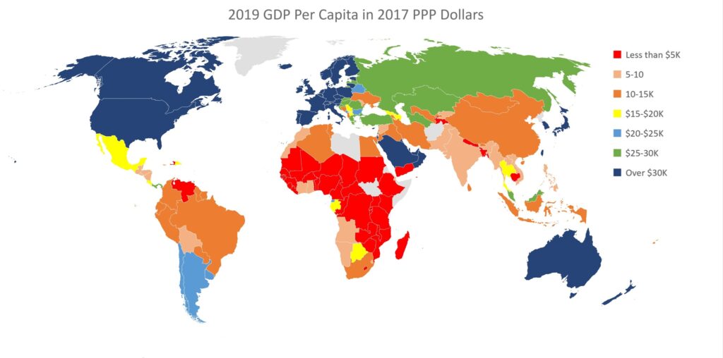
Figure 46: GDP per capita in 2017 purchasing power parity dollars Data Source: Feenstra et al. (2015), Penn World Table (2021) (2021) – with major processing by Our World in Data[1] WW103
This chart shows per capita gross income in “purchasing power parity” (PPP) dollars, which corrects for local prices. Keep in mind that gross GDP includes investment and other spending that doesn’t flow through to current personal incomes, in the US 67% of GDP is personal consumption[2]. Some of the most densely populated countries in the world (India, many in Africa) have quite low GDPs per capita. Even if income was distributed evenly in those countries, everyone would be very poor by rich country standards.
| Purchasing Power Parity Dollars To make GDP per capita and other comparisons meaningful between countries, they are generally given in terms of “purchasing power parity” or PPP. Purchasing power parity adjusts for differences in price levels between countries in much the same way that the Consumer Price Index adjusts for inflation between years. To calculate PPP, a basket of goods and services is priced in the country’s currency and compared to the price of that basket of goods in the United States. This gives a conversion rate which can be used to meaningfully compare the purchasing power of incomes around the world in terms of the US dollar. Purchasing power parity prices are sometimes referred to as being in “international dollars”. From a US perspective, an international dollar is just a US dollar, so when we say that half the population of the world earns less than $7.50 a day (roughly the case in 2019[3]), that is in US purchasing power. Of course, it is virtually impossible to live on $7.50 a day in the US or any other advanced economy, so many of the basic needs of people around the world are met through non-market means such as subsistence agriculture. Note that poorer country GDPs quoted in PPP dollars are considerably higher than if they were quoted in exchange rate US dollars. |
Clearly differences in productivity between countries is a major factor in world income distribution. The chart below shows the distribution of average per capita income if 67% of GDP went to personal income in each country. The blue bars are the percent of the world population in each group of countries with the given average GDP per capita, and the orange bars show the percentage of total world GDP in that country group.
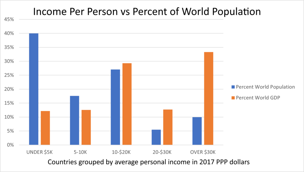
Figure 47: This chart shows population grouped by average annual personal income (calculated as 67% of per capita GDP) for groups of countries, along with the percentage of global GDP for these countries. Sources: World Bank indicator data on GDP per capita in 2017 PPP dollars and country populations in 2019. WW121
Most of the world’s population falls into poor countries ($5K is less than $14/day per person in 2017 US purchasing power) and middle-income countries of which China is the largest. As can be seen, the rich countries have nearly 35% of the world’s income and output, with 10% of the world’s population. The actual median 2019 per capita income worldwide estimated by the World Bank is $7.50/day ($2,738 annual). Currently there are 65 countries with a total population of 3 billion people that don’t have a sufficient GDP to provide even that level of income, even if their net national income was completely evenly distributed![4]
Income Distribution Within Countries
In addition to differences in productivity between countries, income distribution varies greatly within countries as we saw for the United States. In the case of the US, we saw that the income distribution was pretty highly skewed toward the upper end, and the US is fairly typical as the chart below shows.
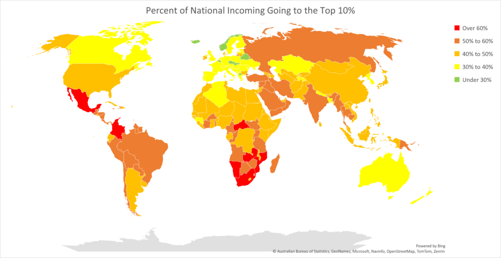
Figure 48: Percent of Income Going to the Top 10% Source: World Inequality Database[5]. WW104
World-wide, some estimates indicate that the top 10% get about half of the world’s income[6].
Overall Income Distribution
The combination of differences in GDP per capita between countries, and the skewed distribution of income within countries, determines world income distribution. The World Bank provides an online tool where one can see what portion of the world’s population lives below an arbitrary poverty line[7]. The Bank currently uses $2.15/day per person in 2017 PPP dollars as the benchmark for extreme poverty, and by that benchmark, the number of extremely poor people has declined from 2 billion in 1990 to 659 million in 2019. However, if you push the poverty line up to $20/day per person in PPP spending power, the number of people below that line has increased considerably, going from 4.4 billion in 1990 to 6 billion today. This is consistent with increases in agricultural productivity and workers moving from agriculture into other relatively labor-intensive lower productivity work while world population continued to grow, a scenario we discussed in the section on productivity convergence[8].
The map below shows the median per capita income in PPP dollars by country which puts together the effects of both income distribution between and within countries.
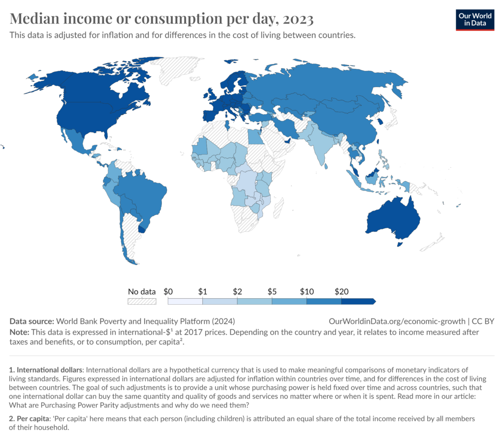
Figure 49: Median income by country in 2017 PPP dollars. Source: Our World in Data visualization of World Bank data https://ourworldindata.org/grapher/daily-median-income?tab=map
This chart, like many of the referenced ones, lets you hover over a country on the web to see its median per capita income, and adjust the year to see changes over time. The skewed legend, which breaks down the $10 increment into 4 categories and the remaining $90 into 3, reflects the skewed distribution of income around the world. By advanced-economy standards, the vast majority of people worldwide are poor.
How has income distribution, both within and between countries changed over time? For a really long look back, the World Inequality Lab has scrunched the numbers since 1820! Here’s a chart from their World Inequality Report 2022[9]:
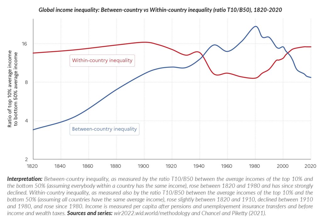
Figure 50: Within Country and Between Country Inequality. Graphic: World Inequality Lab World Inequality Report 2022. WW176
Within-country inequality, as measured by the ratio of income between the top 10% and the bottom 50% is back to levels last seen in the early 1900’s. The average income of the top 10% is almost 16 times the average income of the bottom 50%. As we have seen in the US, the top 10% income is itself highly skewed. On the other hand, the average income ratio between the top 10% of countries and the bottom 50% reached a peak in 1980 and has since declined. As the author’s note, “China ceased to be part of the bottom 50% of the world in 2010, so the continuation of the decline after 2010 is due to the high-growth performance of countries like India, Indonesia, Vietnam, and some (but not all) Sub-Saharan African countries relative to growth rates in rich countries. We should also stress that despite this decline, Between-country inequality remains very high in absolute terms: in 2020, it is roughly at the same level as it was in 1900.”
[1] https://ourworldindata.org/grapher/gdp-per-capita-penn-world-table
[2] Personal income is higher because it includes taxes and savings, however that statistic is not available for worldwide comparisons. Personal consumption as a percent of GDP varies by country and can tell some interesting stories. In some really poor countries, personal consumption is greater than GDP because of foreign aid & remittances, while in Ireland it’s about 30% because Irish (stated) GDP is pumped up by Ireland’s tax shelter status. Here are some other personal consumption share of GDP numbers from 2019: Brazil 65%, India 61%, Japan 55%, Germany 52%, and China 39%. For the world as a whole it’s 56%. The US has the highest consumption percentage of any major economy. Source: World Bank https://data.worldbank.org/indicator/NE.CON.PRVT.ZS
[3] This includes income distribution. 2017 PPP dollars. Source: https://pip.worldbank.org/home. Move the slider to $7.50. 3.87 billion people, roughly half the world’s population in 2019, earn less than that.
[4] Based on allocating 67% of GDP to personal income. Source: World Bank Indicator Data –
GDP per capita, PPP (constant 2017 international $)
[5] https://wid.world. Much the same picture emerges from the GINI coefficient, see https://ourworldindata.org/economic-inequality#all-charts.
[6] Based on World Inequality Data as reported in a UN paper that also discusses the various sources for income inequality data and what is included in each. “The Inequality Gap: The Bottom 40 May Be Further Away Than We Thought.” n.d. UNDP. Accessed July 29, 2023. While these are pre-tax and subsidies, the main (and substantial) difference between PovCalNet and WID is again due, like the US estimates, to the former being based on surveys and the latter administrative sources. In both the US and World cases, surveys seem to significantly understate the top 10% (and higher) income. https://www.undp.org/library/dfs-inequality-gap-bottom-40-may-be-further-away-we-thought.
[7] https://pip.worldbank.org/home . This is based on actual income levels, not GDP per country.
[8] World population has grown from 5.3 billion in 1990 to about 8 billion today.
[9] “The World Inequality Report 2022.” October 20, 2021. https://wir2022.wid.world/chapter-2/.
