We’ve covered a lot of ground in looking at US income distribution and how it has changed, let’s summarize some of the key points.
- The US is a very wealthy country with a statistical household income of $177,774 in 2019, according to the national accounts Table 12: 2019 Sources of Personal Income. Source: BEA Table 2.1 [1].
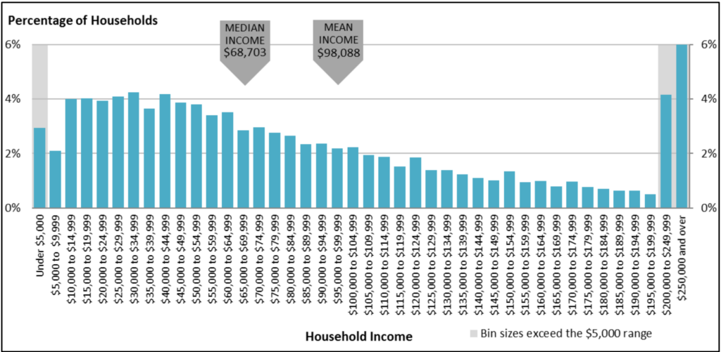
- Income distribution is skewed; most households earn incomes well below the statistical mean (Figure 45 below), but there is a long “tail” of high-income households. There is a small group of households with truly huge incomes that gives the upper 10%, and especially the upper 1%, a disproportionate share of national income (Figure 34 and Figure 35 ).

Figure 45: Distributions of Households by Income 2019. Source: Sarah A. Donovan, Joseph Dalaker, Marc Labonte, Paul D. Romero. 2021. “The U.S. Income Distribution: Trends and Issues.” Congressional Research Service. https://sgp.fas.org/crs/misc/R44705.pdf. See the notes there. Their source is the U.S. Census Bureau, Annual Social and Economic Supplement. WW172
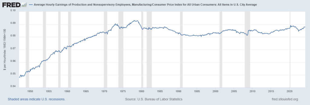
- Over the last 50 years, wages for most jobs have grown in purchasing power, but quite slowly. Labor productivity has grown far more, but much of that increase can be attributed to replacing workers with machines which improves the productivity of the remaining workers. This chart shows manufacturing workers.

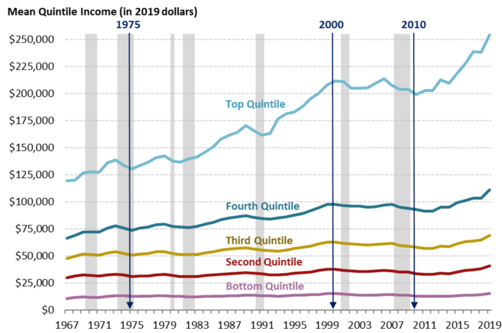
- Wages in some occupations have grown faster than others, resulting in greater wage inequality.

- Since the turn of the 21st century, declared corporate profits have increased to nearly $1 trillion a year in 2019, increasing income inequality because profits flow to stock and bond holders. The wealthy hold large portfolios of stocks and bonds.
[1] This is pretax, based on an average statistical household size of 3. 14. Disposable income is lower as shown in Table 12. You may note the HUGE discrepancy between household personal income as reported by the Census from surveys (Figure 45) and the national accounts tables prepared mostly from administrative sources. Such differences are the bane of researchers or even writers simply trying to report “facts”. There are papers that explain some of these differences. See for example https://www.census.gov/content/dam/Census/library/working-papers/2004/demo/CPS-BEA.pdf.
