As we’ve just seen, the substitution of capital for labor can increase wage inequality, and higher corporate profits increase income inequality.
The chart below shows some occupations and how they have done in terms of earnings. These are personal incomes, not household incomes. The selection of occupations is somewhat random: the data is from the census, and I chose a few professions for which data is available over the 50-year period. Data over that period isn’t available for computer programming, and many other professions,
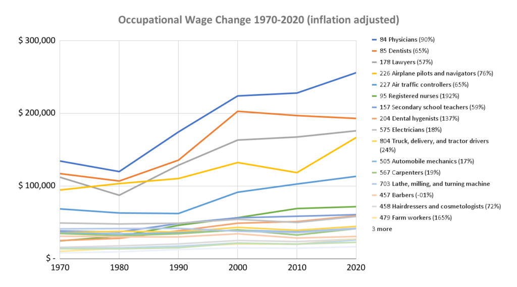
Figure 40: wage changes 1970-2020 inflation adjusted (PCE) to 2020 dollars. The legend on the right is ordered by wage in 2020, the percentage in parentheses shows the increase in income over the period. Source: Census data: INCTOT via IPUMS[RF1] WW142
The number in parentheses shows the inflation adjusted increase in pay. The starting point is important in determining actual dollar increases. For example, airline pilots have seen only a 76% increase in their incomes, but they started at a higher level, so their inflation adjusted income was $72,236 more than in 1970, while farm workers had a 165% increase that amounted to only $16,594 in 2020 dollars. In short, if everyone’s real incomes increased by the same percentage, the entire wage pie would grow and everyone’s slice would remain the same proportion of the whole, but a percentage of a bigger piece is always going to be more than that same percentage of a smaller piece. So, in that sense, yes, it’s good the pie grows, but even with equal percentage wage growth, spending power grows unequally. None of the growth rates are particularly high. A one percent annual boost in real income amounts to 164% over 50 years. Over the same time period GDP per employee rose 124% after adjusting for inflation. The table below shows the same data ranked by the increase over 50 years.
Table 16: Occupations ranked by inflation adjusted wage growth 1970 – 2020
| Occupation | Percent Increase |
| 95 Registered nurses | 192% |
| 479 Farm workers | 165% |
| 204 Dental hygienists | 137% |
| GDP per employee | 124% |
| 435 Waiter/waitress | 108% |
| 84 Physicians | 90% |
| 744 Textile sewing machine operators | 78% |
| 226 Airplane pilots and navigators | 76% |
| 458 Hairdressers and cosmetologists | 72% |
| 227 Air traffic controllers | 65% |
| 85 Dentists | 65% |
| 436 Cooks, variously defined | 65% |
| 157 Secondary school teachers | 59% |
| 178 Lawyers | 57% |
| 804 Truck, delivery, and tractor drivers | 24% |
| 567 Carpenters | 19% |
| 575 Electricians | 18% |
| 505 Automobile mechanics | 17% |
| 703 Lathe, milling, and turning machine operatives | 1% |
| 457 Barbers | -1% |
Only registered nurses, farm workers, and dental hygienists saw their wages grow faster than the general increase in economic output per employee.
Changes in average occupational wages along with changes in employment by occupation turn out to be poor at explaining increasing income inequality[1].
The chart below shows how household income distribution has changed.
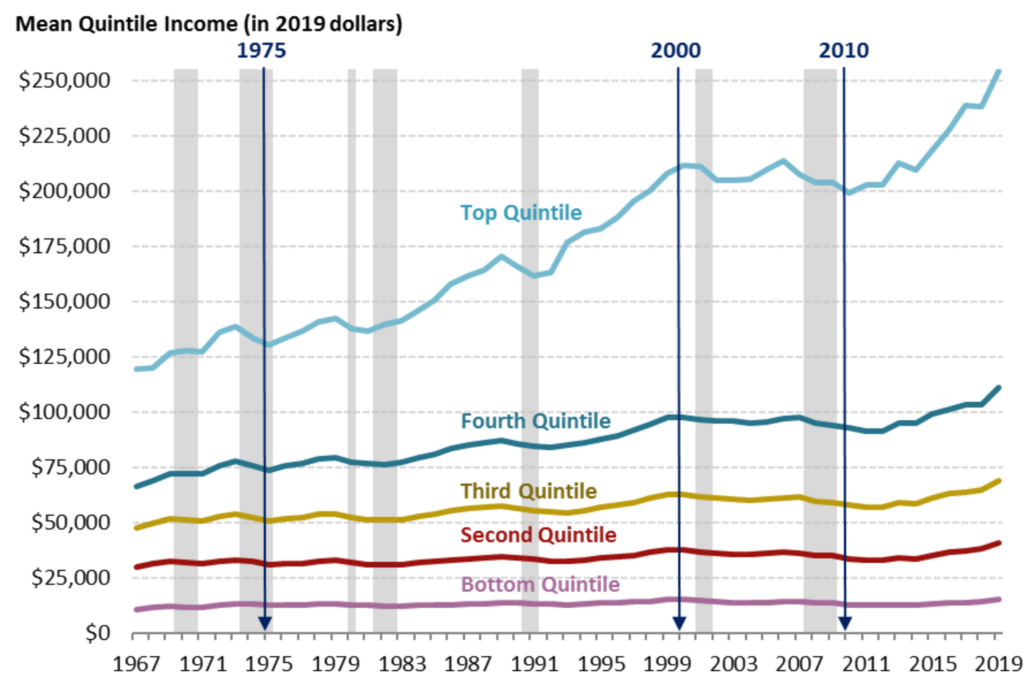
Figure 41: Inflation adjusted household income by quintile. Source: Figure created by the Congressional Research Service (CRS) based on data from U.S. Census Bureau, Current Population Survey (CPS), Annual Social and Economic Supplements (ASEC). Recession data (in gray) are from the National Bureau of Economic Research.[2]
What factors have kept wages in check for lower- and middle-income workers relative to higher-income workers? If we refer back to basic economics, wages will be determined largely by supply and demand factors. As labor productivity increased, especially in farming and manufacturing, the need for general labor dropped, reducing wages. Trade too resulted in worker dislocations which led to an excess of labor. At the same time, and possibly related to the soft labor market, unionization declined which gave labor less bargaining power. At the lower end of the wage spectrum, declining real minimum wages and competition from immigrants took a toll. Meanwhile demand increased, and along with it wages, for IT workers, doctors, workers in finance and investment banking, and legal professionals[RF2] . In addition, pay went up substantially for top managers. The result has been a shrinking of the middle class, with fewer middle-class households and more low- and high-income households as a percent of the total as shown below[3].
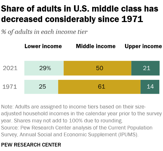
Figure 42: US Middle Class Population Share. Source: PEW Research WW169
So, some of the increase in income inequality we’ve seen can be attributed to uneven changes in the labor market due to increasing productivity which is ongoing, and trade where the dislocations are largely behind us. However, the increase at the very top of the income distribution cannot be attributed entirely or even mostly to uneven wage growth. Very few “salaries” amount to $28,721,820 as shown for the top .01% in Figure 43 below[4].
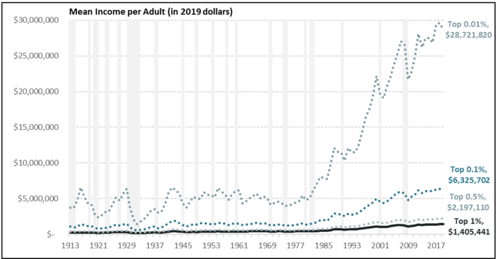
Figure 43: Mean Income Per Adult, Top 1%, 1913 to 2017 – Note that lower income groupings include higher ones (e.g. top 1% includes top .5% and .01%). Source: Sarah A. Donovan, Joseph Dalaker, Marc Labonte, Paul D. Romero. 2021. “The U.S. Income Distribution: Trends and Issues.” Congressional Research Service.
The extreme increase in the very top of the income distribution coincides with the period in which corporate profits soared as shown in Figure 39. Who makes these extreme incomes and how? We’ve already encountered one major group of high-income earners: the owners of closely held companies. These folk take home 14% of the income in the top 0.1% of earners[5]. Another group that has gotten a lot of attention is CEOs. CEO pay at the largest 350 public US companies grew 1,460% from 1978 to 2021 to $28 million, adjusted for inflation, while typical workers saw an increase of 18%[6]. The median CEO compensation for the broader Russell 3000 firms was $4.5 million in 2019[7]. The curve of CEO compensation at these companies looks very much like the growth of top-level incomes we see in Figure 43.
The final group of high-income earners we need to mention is simply wealthy folk, a larger group that includes most of the two just mentioned. As we saw in Figure 36, the very top incomes come from capital income and gains. Capital income largely varies with corporate profits, which increases dividends on stock, as well as stock prices. Stock and bond ownership is concentrated at the top of the income distribution, so this income is as well.
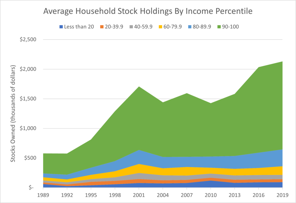
Figure 44: Stock holdings by income percentile group. This includes stock held in 401Ks. Source: Federal Reserve, Survey of Consumer Finance[8].
[1] https://www.epi.org/publication/technology-inequality-dont-blame-the-robots/
[2] Inflation is adjusted using the Consumer Price Index (CPI-U-RS). Census data understates top incomes. Source: Sarah A. Donovan, Joseph Dalaker, Marc Labonte, Paul D. Romero. 2021. “The U.S. Income Distribution: Trends and Issues.” Congressional Research Service. https://sgp.fas.org/crs/misc/R44705.pdf.
[3] See https://www.pewresearch.org/short-reads/2022/04/20/how-the-american-middle-class-has-changed-in-the-past-five-decades/ for the data and how middle class is defined.
[4] Or the $43,000,000 in household income for the .01% as we saw in Figure 35. This data mostly comes from tax returns, so it reflects declared income.
[5]Boar, Corina, and Virgiliu Midrigan. 2023. “Should We Tax Capital Income or Wealth?” American Economic Review: Insights, 5 (2): 259-74.
[6] https://www.epi.org/publication/ceo-pay-in-2021/
[7] https://corpgov.law.harvard.edu/2021/10/07/ceo-and-executive-compensation-practices-in-the-russell-3000-and-sp-500/
[8] https://www.federalreserve.gov/econres/scf/dataviz/scf/chart/#series:Stock_Holdings;demographic:inccat;population:1,2,3,4,5,6;units:mean;range:1989,2019
[RF1]Check to see if this includes investment income!
[RF2]This is not backed up by data, and not true for doctors
